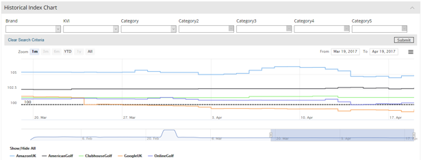
This is a powerful chart that benchmarks your prices versus each of your competitors over a period of time. You can select different time periods to track by – to do this you click on the buttons next to zoom, for example 1m is one month, 1y is one year and so on. It indexes your products and prices at 100 and then compares how your competitors index in relation to you.
The dotted line shows indexes higher than your prices, below the line indexing is lower than your prices. Click on the individual competitor names at the bottom of the chart to focus in on specific retailers.