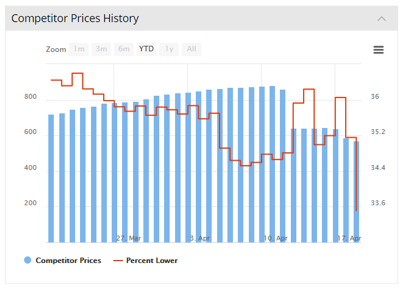
This chart plots the total number of competitor prices you are tracking (the blue bars) and the % of those prices that are lower than your prices (the red line). This is a useful general indicator of how competitive your prices are and the trend over time.
It’s also a useful indicator of the overall effect of your price changes over time.
In this example of the Competitor Prices History chart, the general trend for the % lower red line is downward, which suggests the user is moving in the right direction i.e. becoming more competitive.