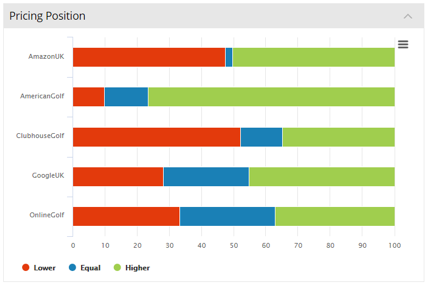
This chart shows the % of competitor prices that are lower, the same, and higher than your prices. This is a useful general indicator of how your prices compare to each of the competitors you are tracking.
This chart helps you understand your price position versus your key competitors.
In this example Amazon and Clubhouse Golf are the most competitive retailers we are tracking and we appear to be in a good position versus American Golf.
